
In this document:
Introduction
In this guide, we want to show you how to ‘White Label’ the plugin. This isn’t a complete white-label solution but it will remove most of our branding assets. To do this, we’ll use a couple of CSS snippets to hide our logos and Foxy’s images from the Admin App.
For this to work out properly, you’ll need to create a new custom.css file in the theme. Here’s a guide with more information on how to add it: Add Admin App Custom CSS.
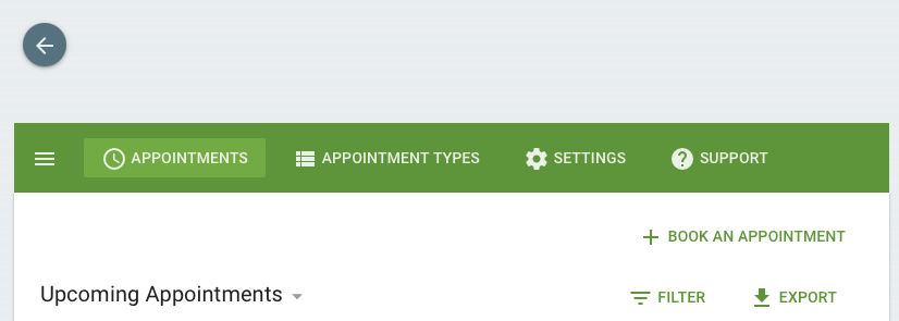
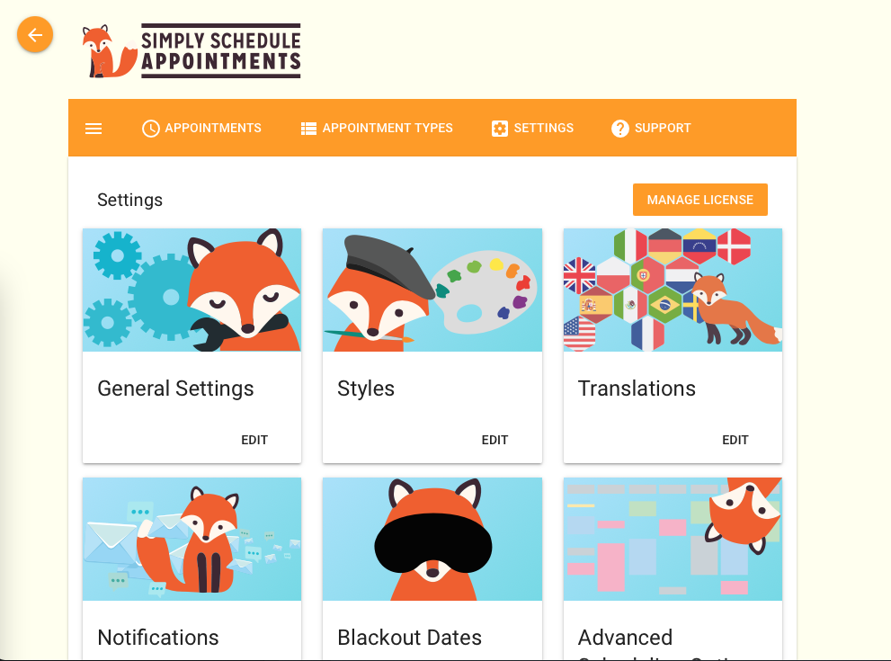
SSA Logo
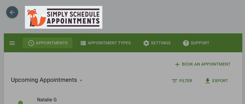
To hide the logo add this CSS snippet to your custom.css file:
/* Hide SSA Logo */
.app-header img {
    display: none !important;
}
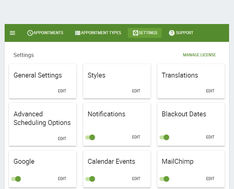
Settings’ Images with Foxy
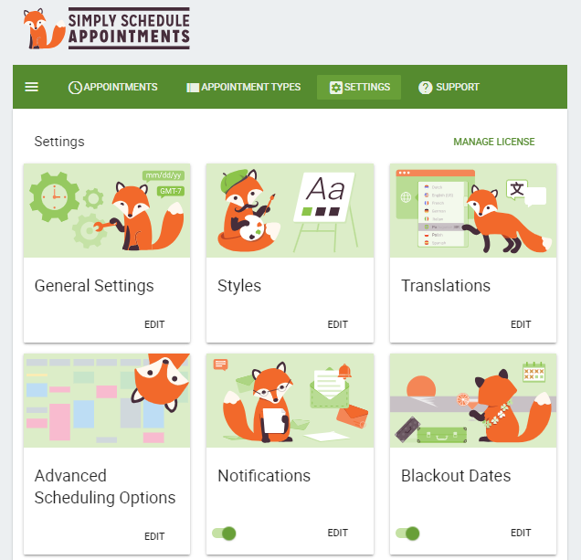
To hide Ms. Foxy’s glamour shots, add this CSS to your custom.css file:
/* Hide Settings Images of Foxy */
.md-card.settings .md-card-media {
    display: none !important;
}
This CSS makes the admin settings full-width and removes the sidebar:
.md-layout.side-settings-col.md-column {
display: none;
}

@media screen and (min-width: 960px){
.md-layout.main-settings-col{
flex-basis: 100%;
max-width: 100%;
}
}
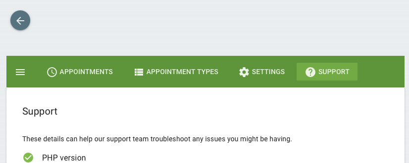
You can remove the Contact Support Button under the Support tab if you’re white-labeling for a client. This will ensure that they contact you whenever they need any help.
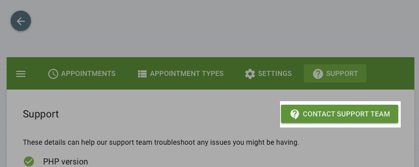
To hide the ‘Contact Support Team’ button:
/* Hide Contact Support Team Button */
.support .md-toolbar .md-theme-default.md-button:not([disabled]).md-primary.md-raised,
.support .md-toolbar .md-theme-default.md-button:not([disabled]).md-primary.md-fab {
display: none !important;
}
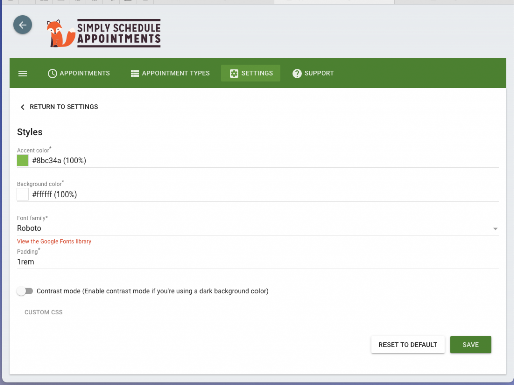
Change the Background and Accent Color of the Admin App
Switch out the word orange for your desired accent color.
And, the word ivory for your desired background color.
/* Change the accent color of the admin app */
.embed .md-theme-default.md-toolbar,
.md-theme-default.md-toolbar,
.md-theme-default.md-button:not([disabled]).md-primary:not(.md-icon-button),
.md-layout .md-theme-default.md-button:not([disabled]).md-primary:not(.md-icon-button),
.md-layout .main-settings-col .md-toolbar .md-button.router-link-active,
.md-layout .md-layout.md-theme-light-green.md-button:not([disabled]).md-primary.md-raised,
.md-layout .md-theme-reverse.md-switch.md-checked .md-switch-thumb,
.md-layout .md-theme-reverse.md-switch.md-checked .md-switch-container,
.md-layout .md-toolbar .md-button:hover:not([disabled]):not(.md-raised):not(.md-icon-button):not(.md-fab),
.md-layout .md-theme-default.md-button:not([disabled]).md-primary.md-raised:hover,
.md-layout .mdc-theme-name--light-green.mdc-chip,
.md-layout .mdc-theme-name--light-green .mdc-chip__icon.mdc-chip__icon--trailing,
.md-layout .mdc-theme-name--light-green .mdc-chip__icon.mdc-chip__icon--trailing:hover,
.md-layout .md-theme-light-green .cov-date-monthly,
.md-layout .md-theme-blue-grey.md-button:not([disabled]).md-primary.md-fab{
background-color: orange;
color: white;
}

.md-layout .md-card.md-theme-light-green {
border-top: 5px solid orange;
}

html .md-layout .md-theme-default.md-radio.md-checked .md-radio-container {
border-color: orange;
}

.md-layout .md-theme-default.md-select-content .md-menu-item.md-selected,
.md-layout .md-theme-default.md-icon.md-primary,
html .md-layout .md-theme-default.md-radio.md-checked .md-ink-ripple, html .md-theme-default.md-radio .md-ink-rippe,
.md-layout .mdc-theme-name--light-green.mdc-icon-button, .mdc-theme-name--light-green .mdc-icon-button,
.md-layout .md-theme-default.md-tabs.md-transparent>.md-tabs-navigation .md-tab-header.md-active,
.md-layout .md-theme-default.md-tabs.md-transparent>.md-tabs-navigation .md-tab-header:focus,
.md-layout .md-theme-default.md-list .md-list-item .router-link-active.md-list-item-container,
.md-layout .md-theme-default.md-list .md-list-item .router-link-active.md-list-item-container>.md-icon {
color: orange;
}

html .md-layout .md-theme-default.md-checkbox.md-checked .md-checkbox-container,
.md-layout .md-theme-default.md-checkbox.md-primary.md-checked .md-checkbox-container,
.md-layout .md-theme-reverse.md-checkbox.md-checked .md-checkbox-container{
background-color: orange;
border-color: orange;
}

.md-layout .md-theme-default.md-tabs.md-transparent>.md-tabs-navigation .md-tab-indicator,
.md-layout .ssa-booking-dialog .md-dialog .close {
background-color: orange;
}

.md-layout .ssa-import-export .export-code:focus {
border-color: orange;
outline: 1px solid orange;
}
/* ————————————————————————— */

/* Change the background color of the admin app */
body {
background: ivory;
background-color: ivory !important;
}
Related Guides
-

Adding Custom CSS Stylesheets
-
Custom Email Styles for Notifications
-

Styling the Booking Calendar
-
Helpful Customization Guides